-
Interactive DashboardsCreate interactive BI dashboards with dynamic visuals.
-
End-User BI ReportsCreate and deploy enterprise BI reports for use in any vertical.
-
Narrative Data StoriesThe Next Evolution of Data Storytelling
-
Visual Data Pipeline BuilderDesign Complex Data Flows, Simply.
-
Wyn ArchitectureA lightweight server offers flexible deployment.
-
 Wyn Enterprise 7.1 is ReleasedThis release emphasizes Wyn document embedding and enhanced analytical express...
 -
 Choosing an Embedded BI Solution for SaaS ProvidersAdding BI features to your applications will improve your products, better serve your customers, and more. But where to start? In this guide, we discuss the many options.
-
Visual GalleryInteractive sample dashboards and reports.
-
BlogExplore Wyn, BI trends, and more.
-
WebinarsDiscover live and on-demand webinars.
-
Customer SuccessVisualize operational efficiency and streamline manufacturing processes.
-
Knowledge BaseGet quick answers with articles and guides.
-
VideosVideo tutorials, trends and best practices.
-
WhitepapersDetailed reports on the latest trends in BI.
-
 Choosing an Embedded BI Solution for SaaS ProvidersAdding BI features to your applications will impr...
 -

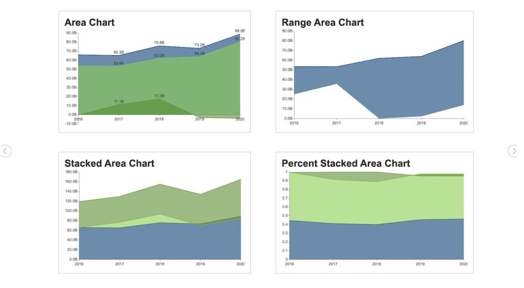
What is the Area Chart?
An area chart is a powerful data visualization that combines the precision of a line chart with the impact of a bar chart. It connects data points to display how values change over time or across categories, while shading the space beneath the line to emphasize volume. This visual style makes it easy to see both trends and total quantities at a glance.
In analytics and business intelligence, area charts are often used to track cumulative data, compare multiple data series, and reveal part-to-whole relationships. Whether you’re monitoring sales growth, website traffic, production output, or financial performance, the area chart helps viewers quickly spot increases, declines, and overall patterns.
In data visualization, an area chart is an extension of a line graph. It combines the line chart and the bar chart to reveal how one or more groups’ numeric values change over a second variable.
Unlike standard line charts, the filled area adds context to the magnitude of change, helping audiences interpret the scale of fluctuations more intuitively. This makes area charts an excellent choice for showing progress toward a goal, long-term trends, or seasonal variations in data.
An area chart is a great chart to visualize a volume change over a period of time. It gives a sense of summation of the quantitative data.
Data is plotted on the x- and y-axis. D values are plotted using data points that are connected using line segments. Unlike inline charts, the area between the line and x-axis is filled with color or shading in an area chart.
In Wyn Enterprise, you can create four types of area charts—Basic Area Chart, Stacked Area Chart, Range Area Chart, and Percent Stacked Area Chart—each designed for a specific type of analysis. Choosing the right version ensures your audience not only understands the numbers, but also the story behind them.
Area Chart Use Cases
Area charts are excellent when describing the overall trend, as opposed to the individual values. Use a stacked area chart for multiple data series with part-to-whole relationships or for cumulative series of values.
Say you have the quarterly sales data for five years. If you want to facilitate a general comparison for your audience, you will use a column or bar chart.
If you’re going to reveal the trend of how sales have changed over the years, you will use a line chart or an area chart.
Here, we’ll give an overview of each and describe how to create all four area charts in Wyn Enterprise.
Basic Area Chart
The basic area chart is used to depict the data series as colored regions that help in comparing the values of multiple series for the same data point. This chart shows trends over time.
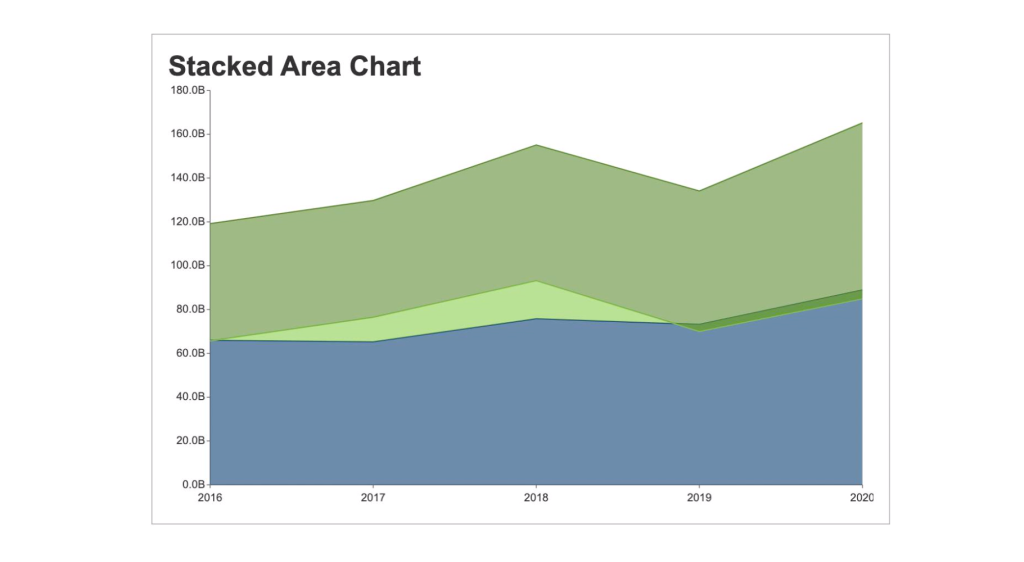
Stacked Area Chart
A stacked area chart depicts data series as stacked regions with different colors that help perform comparisons between multiple series for the same data point.
This chart shows the trend of the contribution of each value over time or other categorical data.
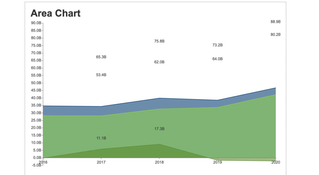
Range Area Chart
The range area chart is used to depict a range of data by plotting the area of two upper and lower values. This chart allows users to see the size difference between their data’s high and low values.
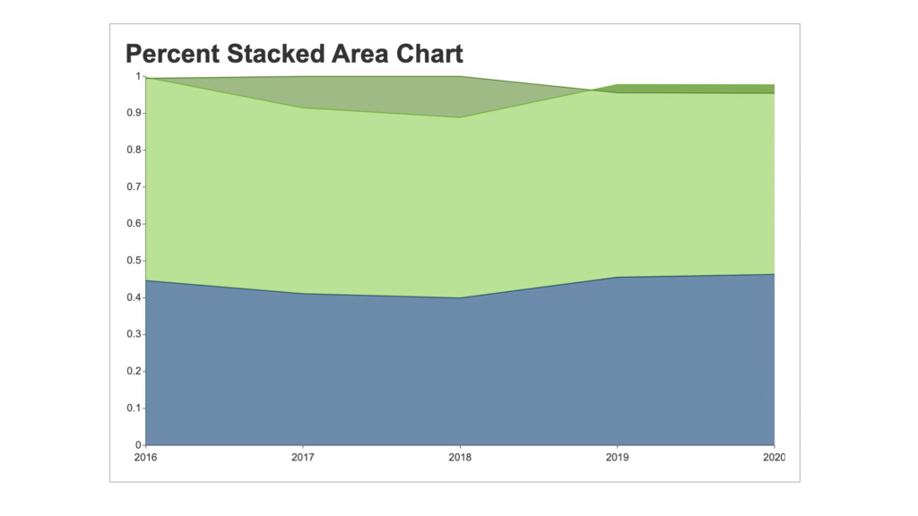
Percent Stacked Area Chart
A percent stacked area chart is used to depict the series of data points with positive and negative values shown overtime to reveal values of multiple series for the same data point.
This chart shows the percentage that each value contributes over time or other categorical data.
Creating Area Charts in Wyn Enterprise
Wyn Enterprise Dashboards have four kinds of Area charts: Basic Area Chart, Stacked area chart, Range Area Chart, and the Percent stacked area chart.
Here, we’ll show you how easy it is to create area charts in Wyn Enterprise. You can skip ahead chapters to individually view the steps for each chart type.
How to Create an Area Chart?
- From the Wyn Dashboard interface, select the visualizations icon.
- Click and drag the “Area Chart” onto the Dashboard canvas.
- Select the data binding tab. Under “Values” you will add the data you are comparing. Under Axis, add data for the x-axis.
- To adjust the design, select the Inspector Tab, next to the Data Binding tab. Here you can adjust the palette, text, and other design properties.
How to Create a Stacked Area Chart?
- From the Wyn Dashboard interface, select the visualizations icon.
- Click and drag the “Stacked Area Chart” onto the Dashboard canvas.
- Select the data binding tab. Under “Values” you will add the data you are comparing. Under Axis, add data for the x-axis.
- To adjust the design, select the Inspector Tab, next to the Data Binding tab. Here you can adjust the palette, text, and other design properties.
How to Create a Percent Stacked Area Chart?
- From the Wyn Dashboard interface, select the visualizations icon.
- Click and drag the “Percent Stacked Area Chart” onto the Dashboard canvas.
- Select the data binding tab. Under “Values” you will add the data you are comparing. Under Axis, add data for the x-axis.
- To adjust the design, select the Inspector Tab, next to the Data Binding tab. Here you can adjust the palette, text, and other design properties.
How to Create a Range Area Chart?
- From the Wyn Dashboard interface, select the visualizations icon.
- Click and drag the ” Range area chart” onto the Dashboard canvas.
- Select the data binding tab. Under “Values” you will add the data you are comparing. Under Axis, add data for the x-axis.
- To adjust the design, select the Inspector Tab, next to the Data Binding tab. Here you can adjust the palette, text, and other design properties.

Laurie Smith
Laurie A. Smith is the Product Marketing Manager for Wyn Enterprise. She managed content development at the Developer Tools Division before moving to the Wyn Enterprise Business Intelligence Team. Laurie holds an MFA in Film and Digital Media Production from Chatham University, an MBA & a Master’s Degree in Journalism and Mass Communications from Point Park University in Pittsburgh, PA.
In addition to working in technology, she also loves beekeeping, the horror movie genre, and carefully cultivating sunflowers.
Find her on LinkedIn.


Loved by industry
experts and real users